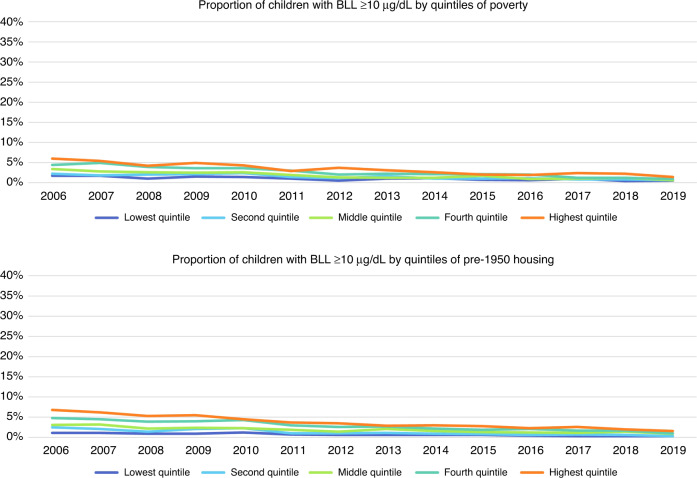
Fig. 6. Longitudinal trends of the proportion of children with elevated blood lead levels ≥10 µg/dL by quintiles of poverty and pre-1950 housing, respectively, 2006 through 2019.
The first panel represents the proportion of children with elevated blood lead levels ≥10 µg/dL by quintiles of poverty, where dark blue represents those block groups in the lowest quintile of proportion of population in poverty and orange represents those block groups in the highest quintile of proportion of population in poverty. The second panel represents the proportion of children with elevated blood lead levels ≥10 µg/dL by quintiles of pre-1950 housing, where dark blue represents those block groups in the lowest quintile of proportion of housing units built pre-1950 and orange represents those block groups in the highest quintile of proportion of housing units built pre-1950.

