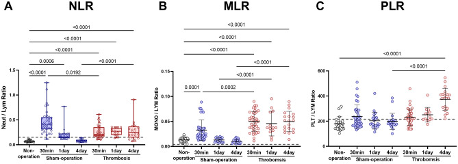
Figure 3.
Comparison of neutrophil lymphocyte ratio (NLR), monocyte lymphocyte ratio (MLR), and platelet-lymphocyte ratio (PLR). (A) NLR. (B) MLR. (C) PLR. Box plots are for NLR: p values are from Kruskal–Wallis ANOVA and Dunn’s post-hoc tests. The box covers the interquartile interval (25–75%), with the horizontal line in the box representing the median. The whiskers outside the box correspond to the minimum and maximum values. Scatter plots (with mean ± SD) are for MLR and PLR: p values are from One-way ANOVA and Bonferroni's post-hoc tests. Dotted lines represent proposed reference (ratio) values, calculated by using the mean values of the reference WBC differential count6. Note that SDs could not be calculated because of the unavailability of the raw data. Non-operation group (n = 26), Sham-operation groups (n = 37 at 30 min, n = 21 at day 1, and n = 21 at day 4), and Thrombosis groups (n = 39 at 30 min, n = 13 at day 1, and n = 20 at day 4).

