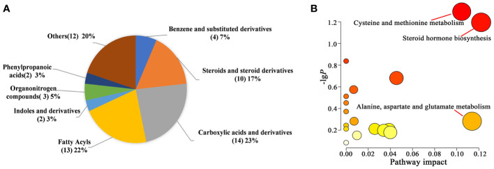
Figure 6.
Differential metabolite analysis between the two groups. (A) Pie chart of HMDB subclass compounds. The different colors in each pie represented different HMDB classifications, and the area represented the relative proportion of metabolites in the classification. The number in the brackets represented the amount of corresponding metabolite class. (B) Pathway analysis of significantly altered metabolites.

