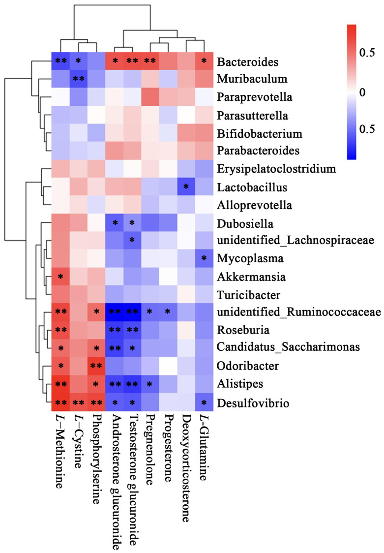
Figure 7.
Heatmap of correlation between metabolites and top 20 relative abundance species at the genus level. The correlation (R) value is displayed in different colors in the figure. The legend on the right shows the range of colors for different R values, with red representing positive correlations and blue representing negative correlations. *P<0.05, **P < 0.01.

