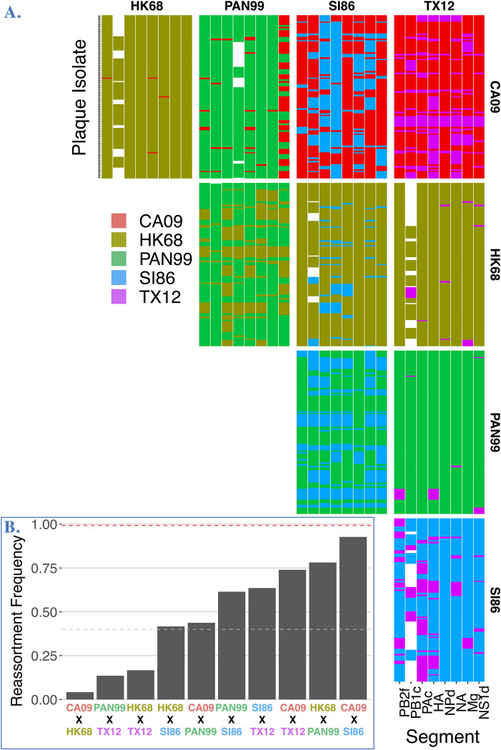
Fig 3. Reassortment plots and rates determined from plaque isolates.
A. Reassortment plot of genotyped progeny isolated from each coinfection performed in this study. Genotypes for individual progeny are depicted as rows in each panel with columns indicating the genotype (i.e. parental origin) for each of the eight segments. White spaces show genotypes where one or more segments were not identified or recovered. B. Reassortment frequencies (proportion of reassortant plaque isolates) for each coinfection. Red line indicates theoretical maximum reassortment, gray line indicates 40% reassortant progeny.

