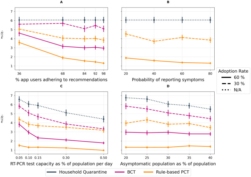
Fig 5. Sensitivity Analyses.
All experiments measure the proportion of the population infected, , within 60 days of an outbreak normalized by mean daily contacts per person per day, . We plot for each tracing method across two app adoption rates as well as against a baseline household quarantining scenario. A lower ratio indicates a better trade-off between epidemic control and restriction of population mobility. We use N/A to represent irrelevance of adoption rate in the baseline scenario as no DCT app is deployed. (A) Recommendation Adherence. Illustrates the impact of varying recommendation adherence (e.g. the daily likelihood of getting a test, quarantining, reducing contacts given an in-app notification is received). (B) Symptom reporting. Illustrates the impact of varying the daily rate of symptom reporting. Note: the plot omits BCT because BCT doesn’t incorporate symptoms in its inputs. (C) RT-PCR Testing Capacity. Illustrates the impact of varying the percentage of the population that can receive an RT-PCR test on any given day, ranging from the observed provincial testing capacity of 0.1% to a highly optimistic value of 0.5% of the population. (D) Infectiousness and symptoms. Illustrates the impact of varying the proportion of cases that will not develop symptoms.

