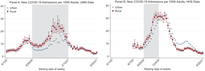
Figure 3.
New COVID-19 Admissions Per 100k Adults in Rural Versus Urban Areas.
1. This figure shows regression-adjusted COVID-19 hospitalization rates per 100,000 adults in rural and urban areas.
2. Red circles represent adjusted hospitalization rates in rural areas. Blue x’s represent adjusted hospitalization rates in urban areas. Error bars report 95% confidence intervals on the difference in rural-urban hospitalization rates, with standard errors are clustered at the county level.
3. The shaded areas highlight the period during which the new admissions rates in rural areas were significantly higher than those in urban areas.
4. UMN data: data from University of Minnesota COVID-19 Hospitalization Tracking Project; HHS data: data from the Department of Health and Human Services.

