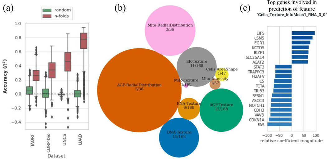
Figure 3. Cross-modality predictions from GE to CP.
(a) Distribution of prediction scores for all morphological features using the MLP model (orange) along with the random shuffle – where the output is shuffled in each iteration – serve as negative controls (green), for each dataset.The y-axis is trimmed at −0.5 for clarity. Distributions are presented as boxplots, with center line being median, box limits being upper and lower quartiles and whiskers being 1.5× interquartile range; the number of points or number of CP features varies among datasets; n=1569 (TAORF), n=1570 (CDRP-bio), n=1670 (LINCS), n=1569 (LUAD). (b) Categories of features with the highest percentage of predictable CP features using GE profiles (median score across all datasets is more than 0.6). The sizes of circles are proportional to the percentage of highly-predictable features in each category. The number of features in each category over the total number of morphological features in that category are also shown for each circle. (c) Example output of exploratory scripts available to researchers to see what are the most relevant genes to a given morphological feature of interest (and vice versa). The x-axis (relative coefficient magnitude) indicates the relative importance of each feature as the percentage of the strongest feature component (here it translates to the most important landmark gene) involved in the prediction of the morphological feature under exploration. The absolute value and sign of this metric corresponds to the level of importance and direction of the linear relationship respectively. A description of each morphological feature extracted by CellProfiler software is available at: https://github.com/carpenterlab/2016_bray_natprot/wiki/What-do-Cell-Painting-features-mean%3F

