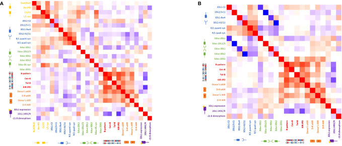
Figure 5.
Heatmap of the Spearman’s correlation coefficients reflecting the strength of the association between the different biological models (A) for the haploidentical cohort and (B) for the genoidentical cohort. Red squares represent a positive correlation between two different models whereas blue squares represent a negative correlation between two different models. See also Supplementary Tables 1, 2.

