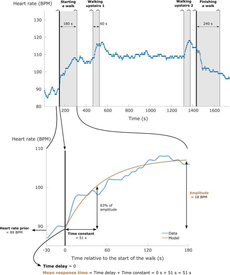
Figure 1.
The upper panel visualises the heart rate response of a subject walking on the orange trail. The start and the end of the walk are indicated by the two thick black lines. Light grey zones indicate the considered time windows for every physical activity transition. The curly braces above the figure represent the time periods that were used to calculate the magnitude of the heart rate response related to the different physical activity transitions. The lower panel zooms in on the considered time window when starting a walk to visualise the meaning of heart rate kinetics (e.g., mean response time and amplitude), as extracted from a kinetic model (orange line).

