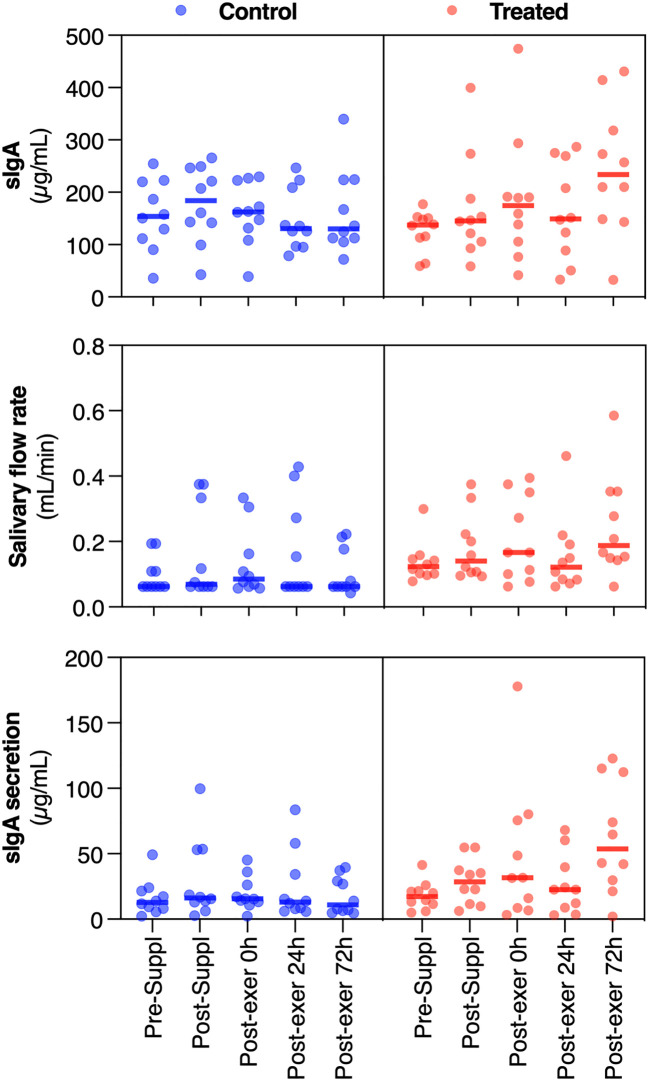
Figure 2.
Dot plots of the measured variables (sIgA, salivary flow rate and sIgA secretion), for the treated and placebo groups, at the different time-points (in abscissa axis). The thick line in each set of points represents the median value. Orange dots are about the treated group, while blue dots are about the control group.

