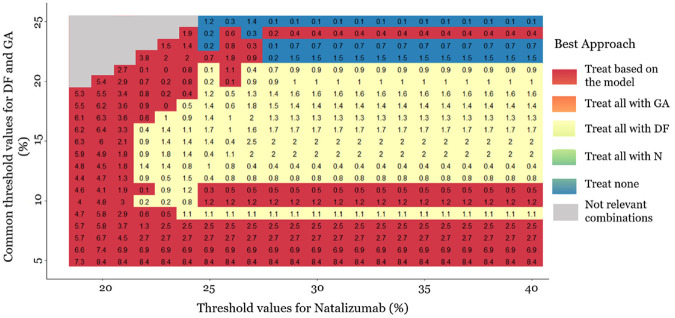
Figure 4.
Heat plot for the decision curve analysis, in a range of threshold values. The same threshold is assumed for dimethyl fumarate (DF) and glatiramer acetate (GA) (4%–25%). The threshold values for natalizumab range between 19% and 40%. The plot shows which approach has the highest net benefit between all possible approaches: (a) treat all patients with placebo, (b) treat all patients with natalizumab (N), (c) treat all patients with dimethyl fumarate, (d) treat all patients with glatiramer acetate, and (e) treat patients based on the prediction model. The empty gray cells present the threshold value combinations that are not clinically possible. The numbers in the cells are differences in net benefit (NB) between the 2 strategies. When the “treat patients based on the prediction model” strategy is the best, the number in the cell (i.e., red cells) is the difference between its NB and the NB of the second-best strategy. Otherwise, we present the difference between the NB of the best strategy and the NB of the “treat patients based on the prediction model” strategy. The presented NB estimations are multiplied by 100.

