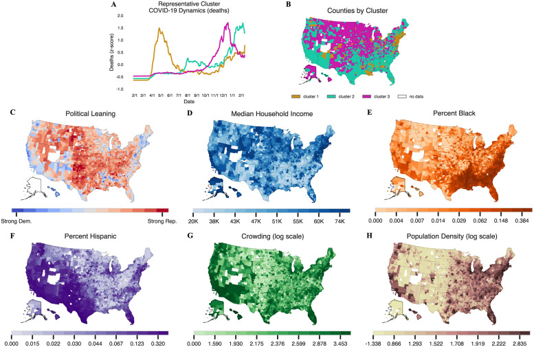
Fig 1. A summary of 3-means clustering and maps of counties included in the analysis shaded by the six different population variables of interest.
(B) A map of cluster assignments for all US counties with data and at least 1 death. Northeastern counties and counties surrounding New Orleans largely comprise the first cluster, while southern counties generally comprise the second cluster, and the remaining counties comprise the third cluster. (C-H) show counties shaded according to six different population and socio-economic variables. (G) and (H) show the log of crowding and population density, respectively. Counties without any color are those with missing data. Counties are plotted using the U.S. Census Bureau’s 2019 shapefiles [24].

