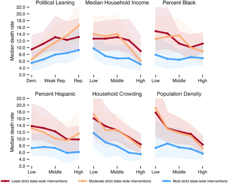
Fig 4. Median death rate in period 3 for each of the six sociodemographic variables broken down by the stringency of state mandates.
For each variable, counties are grouped into quintiles. For instance, in the first plot, the leftmost three points represent the median death rate for the 20% of counties with the highest Democratic vote share in lax-, moderate-, and strict-mandate states, respectively. Shaded bands represent the IQR. The differences in each vertically stacked set of three medians are different at the p < 0.001 level (Mood’s median test).

