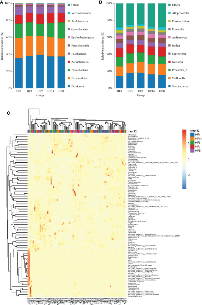
Figure 5.
The distributions of the predominant bacteria. (A) Results at the phylum level. (B) Results at the genus level. The predominant taxa (relative abundance >2% on average) are shown. (C) Heatmap analysis. Each column represents a sample, and each row represents a genus. The cluster trees of genera and samples are shown on the left and upper sides, respectively. Different colors represent different relative abundances.

