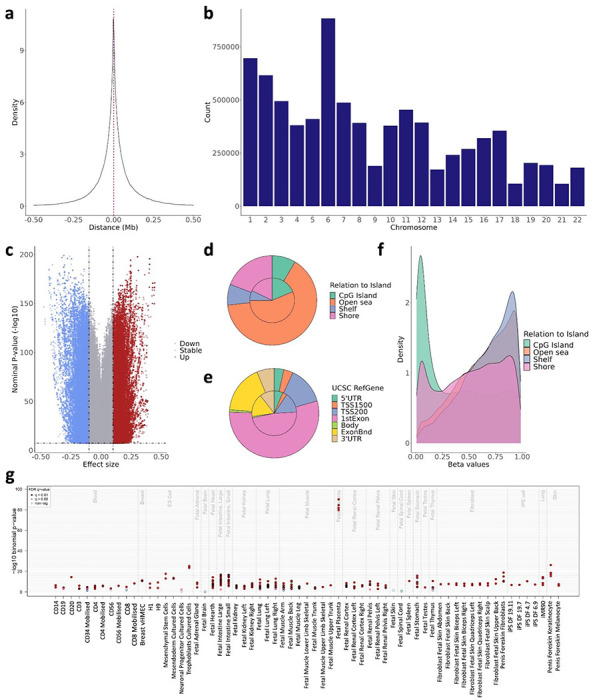
Figure 1. Characterization of the placental cis-mQTLs from the nominal database.

The distance between the SNP-CpG pair participating in the reported cis-mQTLs is displayed as a density plot, where the X-axis represents the distance in Mb. The red line represents the median distance of 44 kb. The distribution of the reported cis-mQTLs along the chromosomes is shown in the b barplot, where the X-axis represents the autosomal chromosomes. The uniform distribution of the effect size from the reported cis-mQTLs is pictured in the c volcano plot, where the Y-axis illustrates the −log10 nominal p-value, and the X-axis the effect size. The blue and the red dots represent the mQTLs with a negative and positive effect, respectively. The distribution of the EPIC array probes (inner circle) and the nominal mQTL-CpGs (outer circle) considering the Relation To Island and the UCSC RefGene annotation is displayed in the d and e piecharts, respectively. The methylation beta values, ranging from 0 to 1, of the participating mQTL-CpGs stratified by the Relation To Island annotation is shown in the f density plot, where the methylation values are found in the X-axis. The eFORGE enrichment of DNase I hotspots considering the top 10,000 nominal mQTL-CpGs is shown in the g plot. The Y-axis represents the −log10 binomial p-value of the enrichment, and the X-axis to the tissue. False Discovery Rate (FDR) corrected q-values below 0.01 and 0.05 are represented by red and pink dots, respectively, while blue dots show q-values >0.05.
