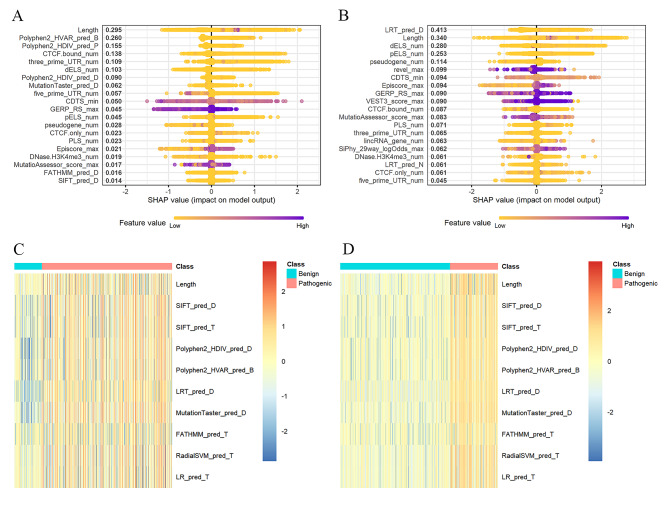
Fig. 4.
SHAP summary plot of the top 20 features of the model. The x axis measures the impact on the model output (right positive, left negative). Taking the feature of length as an example, purple points are on the right. This means prediction effect will be positive when CNVs have a long level of length. SHAP summary plot of the top 20 features of the five-tier classification model for loss (A) and gain (B) CNVs. Differential expression analysis for pathogenic and benign CNVs features. The classes of pathogenic and benign CNVs were shown separately in red and blue. Heat map of the differential analysis in loss (C) and gain (D) CNVs

