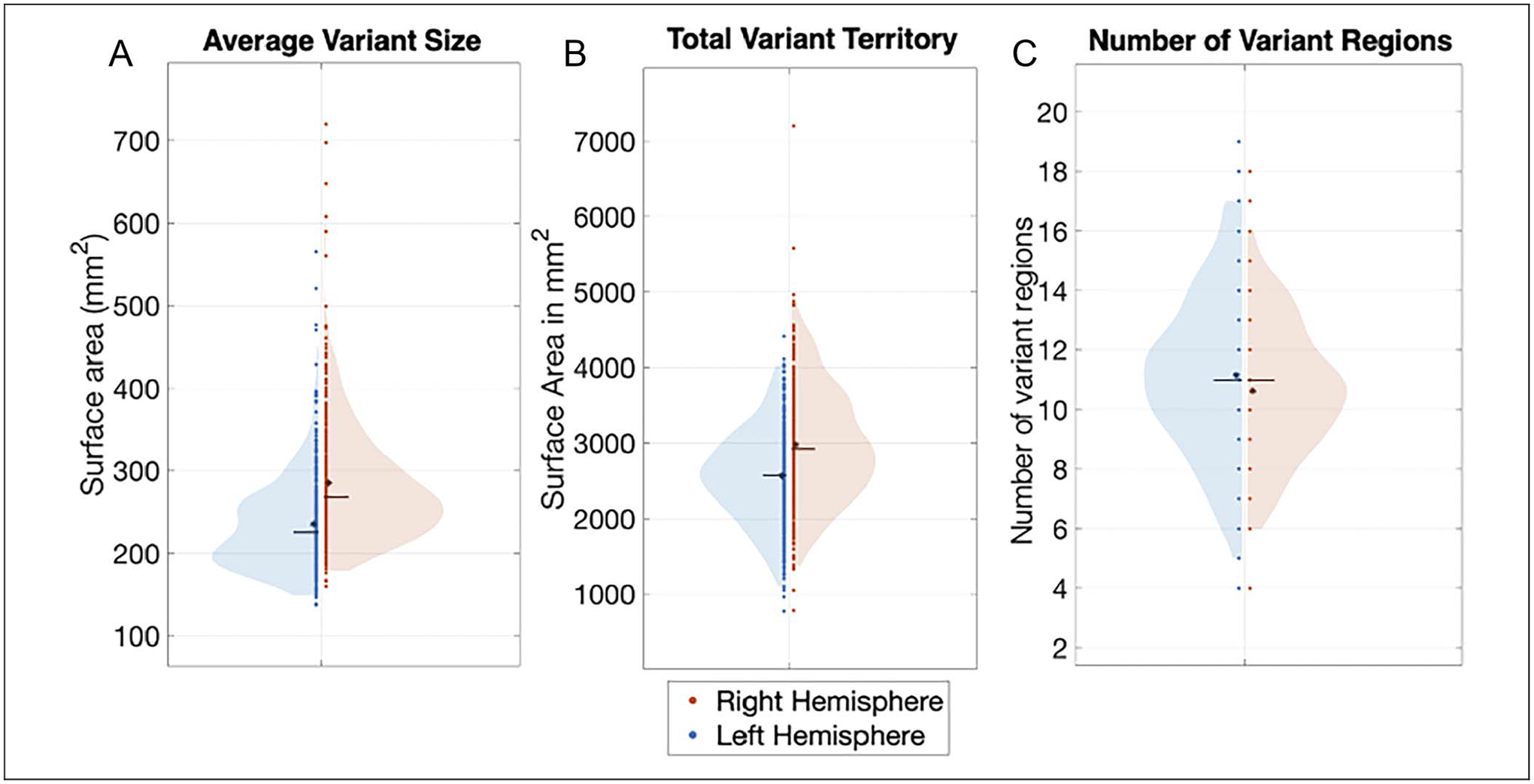
Figure 2.

Comparison of the average number of separable variant regions and variant vertices, and average variant size across hemispheres. The violin plots show the distribution of measures of (A) average variant size in surface area (in mm2), (B) average total variant territory, and (C) average number of network variant regions in the left hemisphere (left side of violin plot, blue) and the right hemisphere (right side of violin plot, red). An asterisk indicates the mean, and a line indicates the median of each distribution. Network variants in the right hemisphere were larger and covered significantly more surface area than in the left hemisphere. Left-hemisphere variants were slightly more numerous (but this effect was somewhat more dependent on processing choices).
