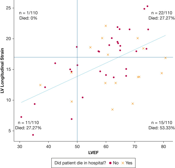
Figure 1.
Scatterplot showing LV global strain (y-axis) vs LVEF (x-axis) at day 1 in 49 patients in whom both were measured. Strain measurements were converted to absolute values. The plot area was divided into four quadrants by the red lines, which indicate the lower threshold for normal strain and ejection fraction: normal strain and low LVEF (one patient), normal strain and normal LVEF (22 patients), abnormal strain and normal LVEF (15 patients), and abnormal strain and low LVEF (11 patients). Patients who died are represented by an ‘×,’ whereas patients who survived are represented by a dot. The percentage of patients who died was highest among those with abnormal strain and normal LVEF (53.33% mortality). The blue line is the best fit linear regression line representing the relationship between strain and LVEF. Patients with values beneath the linear regression line (indicating lower strain than predicted based on LVEF) showed higher mortality than those with values higher than the line (indicating higher strain than predicted based on LVEF). LV = left ventricle; LVEF = left ventricle ejection fraction.

