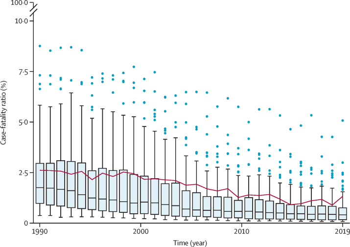
Figure 2.
Box plots of estimated country-specific, community-based measles case–fatality rates, by year
Horizontal lines represent the median case–fatality ratio, boxes represent the interquartile range, and the whiskers (thin lines) represent adjacent values that are (by convention) within 1·5 times the interquartile range. Dots represent patients outside of the adjacent values, known as outliers. The red line shows the case-weighted mean case–fatality ratio for low-income and middle-income countries, by year.

