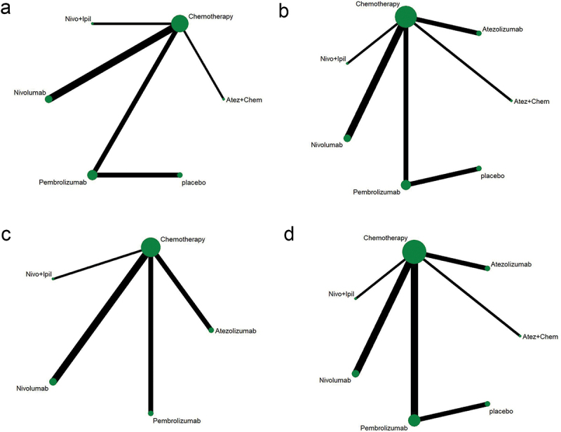
Figure 3.

Network diagram. (a) PFS; (b) OS; (c) ORR; (d) AEs ≥3. The dots in the figure represent different treatment methods; the size of the dots represents the sample size using that treatment; the line between the dots represents a direct comparison between the two treatments; the thickness of the line represents the number of studies. PFS: progression-free survival; OS: overall survival; ORR: objective response rate; AEs: adverse events.
