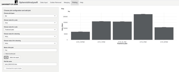
Figure 4.

Shows the Plotting tab. The default plot type is a bar plot, but different plot types can be selected in the “Choose plot type” drop-down list. Values to plot on the Y-axis and X-axis can be selected from the drop-down lists. The plot can be displayed in black and white if desired. Plots can be added to the report via the “Add to report” button and then a file of the plots can be downloaded. n = 8 for each treatment group on the bar chart.
