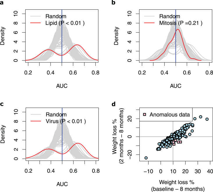
Figure 3. Performance of the prediction models based on biological processes associated with weight loss.
(A–C) Density plots illustrating the area under ROC curve (AUC) measurements of lipid metabolism, mitosis and virus prediction models across the 100 cross-validation runs. The gray lines correspond to the AUC measurements for 100 prediction models constructed of randomly selected genes. The P-value describes the probability that the models based on the randomly picked genes performs better than the models that feature the Lipid/Mitosis/Virus genes as their input parameters. The vertical line at 0.5 AUC indicates the expected performance for random prediction. (D) Scatter plot illustrating weight loss during the whole dietary intervention (baseline—8 months) and during the weight maintenance phase (2–8 months). The individuals who had substantially regained weight (weight loss < −4%) during the weight maintenance phase, despite overall losing weight more than median (anomalous data) are shown with pink squares. The horizontal line shows zero weight loss during the weight maintenance phase whilst the vertical line shows the median of overall weight loss during the 8-months intervention.

