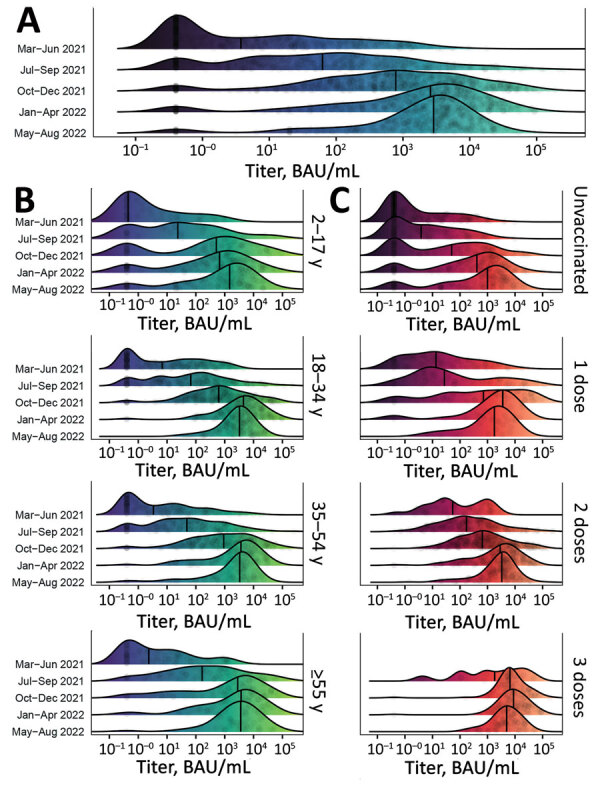
Figure 3.

Distribution of SARS-CoV-2 S antibody titers among participants in a study of SARS-CoV-2 S antibody levels, Dominican Republic, March 2021–August 2022. A) Smoothed density plot demonstrates log-adjusted distribution of anti-S antibody titers among all study participants (N = 2,300), stratified by date interval when study participants were enrolled from earliest (March–June 2021, upper) to latest (May–August 2022, lower). Study interval labels indicate complete months except March 2021, which represents enrollment starting March 22, 2021, and August 2022, which represents enrollment through August 17, 2022. B) Smoothed density plot demonstrates log-adjusted distribution of S antibody titers among study participants (n = 2,300) stratified by age group. Dark purple shading indicates lower S titers and light green higher titers. C) Smoothed density plot demonstrates log-adjusted distribution of S antibody titers among participants (n = 2,293), stratified by number of COVID-19 vaccine doses received from none (unvaccinated, top plot) to 3 (bottom plot). Darker red shading indicates lower S titers and light orange higher titers. Six participants who received 4 COVID-19 vaccine doses not included. Values for 3 vaccine doses for March–June 2021 period plot not shown given sparsity of datapoints (n = 1). For all plots, gray circles represent titer adjusted individual study participant values. Narrow vertical black lines indicates median values. Lower limit of assay measurement is 0.4 BAU/mL, and values <0.4 BAU/mL are represented as 0.4 BAU/mL, with smoothing extending curves below the lower measurement limit. Therefore, density plot shading is used for illustrative purposes. Table 2 and Appendix Tables 2, 3) summarize data used for plots. BAU, binding antibody units; S, spike.
