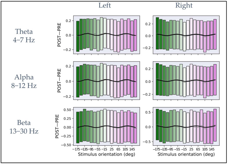
Figure 3.
Plots of iPLV differences between post- and pre-stimulus intervals averaged across macro-orientations of 20° for theta, alpha, and beta frequency bands. In the (left column), the plots represent the average as a function of the macro-orientation for the channels close to the left primary motor cortex for each frequency band. In the (right column), the plots represent the mean as a function of orientation for the channels close to the right primary motor cortex for each frequency band. In each plot, the rectangular boxes represent the data from the 25th to the 75th percentile with the same reference colors as Figure 1B. The lines inside the rectangular boxes represent the mean (gray line). The data are fitted on the mean (solid black curve) with the model described in Equation (2).

