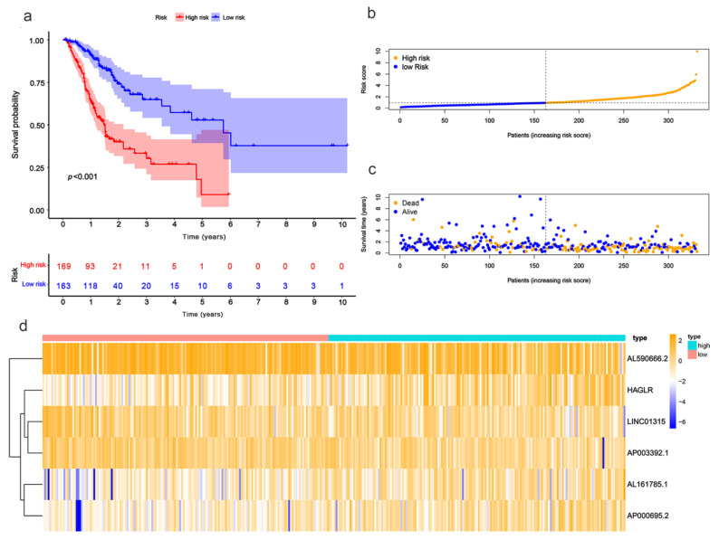
Figure 3.
Evaluation of the prognostic value regarding the six PRlncRNAs’ risk models. (a) Kaplan–Meier OS curves with respect to the high- and low-risk groups. (b) The risk curves, as based on the patient risk scores. (c) Scatter plot, which was established according to the patients’ survival statuses. The blue dots represent survival, and the orange dots represent death. (d) A heatmap that shows the differential expression levels of PRlncRNAs with respect to the high- and low-risk groups.

