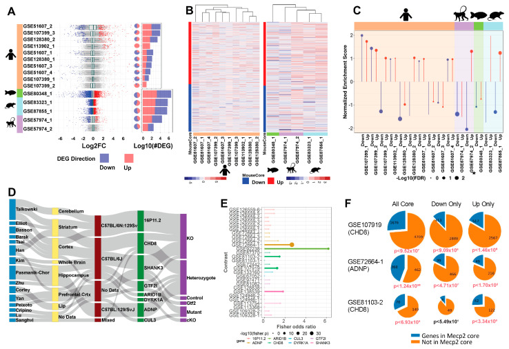
Figure 4.
Mouse transcriptome translation to other models. (A). Distribution of log2 fold change across contrasts with significant (FDR < 0.01) DEGs. Blue and red, respectively, indicate down and up DEGs. Pie charts with the same annotation coloring show the percentage of each contrast’s DEGs in each category. Stacked bar charts with the same annotation color show each contrasts’ DEG quantity. The upper 7 contrasts are human data, and the lower 5 are other species. (B). Heatmaps of log2 fold change plotted to compare direction of dysregulation to the consensus from mouse data. Genes examined are the mouse common core, and plots are annotated on mouse core down and mouse core up. (C). Per-contrast visualization of GSEA normalized enrichment score and FDR. Direction and color of line represents normalized enrichment score, and point size represents log10(FDR). Contrasts are grouped and shaded corresponding to their model of origin. MDS model is annotated with a small star. (D). Sankey plot of ASD contrast metadata characteristics. From left to right: first author, tissue, strain, target gene, and experimental procedure. (E). Fisher’s exact test results. Points sized by –log10(p-value), length determined by odds ratio, data colored by gene. Points are opaque, and overlap to MeCP2 core is considered significant if the Fisher p-value is less than 0.05. (F). Pie charts show the magnitude of overlap between selected ASD contrasts and the MeCP2 common core. Down and up only show genes changed in the same direction in both sets. p-values beneath each plot show the Fisher’s exact test significance of the overlap for each intersection, colored red if the p-value is less than 0.05.

