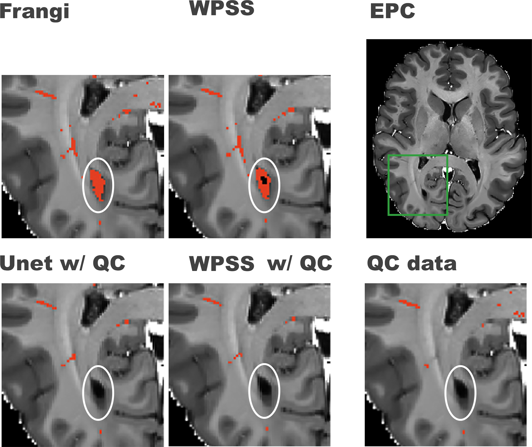
Figure 3. Comparison between results generated by weakly supervised trained models and supervised trained models.

First row from right to left shows the original EPC image, green box notating the region that was zoomed-in for better visualization in the rest of the subplots in this figure, PVS mask (in red) generated by WPSS, and the PVS mask (in red) generated by the Frangi filter. The second row from left to right shows the PVS mask generated by Unet trained with QC data, PVS mask generated by WPSS trained with QC data, and the QC data overlaid on top of the EPC image. White circles denote regions that could present false positive PVS prediction.
