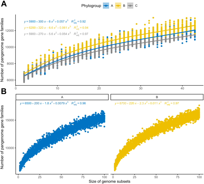
Fig. 2.
Rarefaction curves of the pangenome gene families for each phylogroup. All curves were inferred using polynomial regression lines. Curves in blue represent phylogroup A, yellow B, and grey C. A) The curves were generated by randomly re-sampling 43 genomes from each phylogroup several times and then plotting the average number of pangenome families found on each genome. B) Rarefaction curves were plotted with 100 random genomes from phylogroups A and B.

