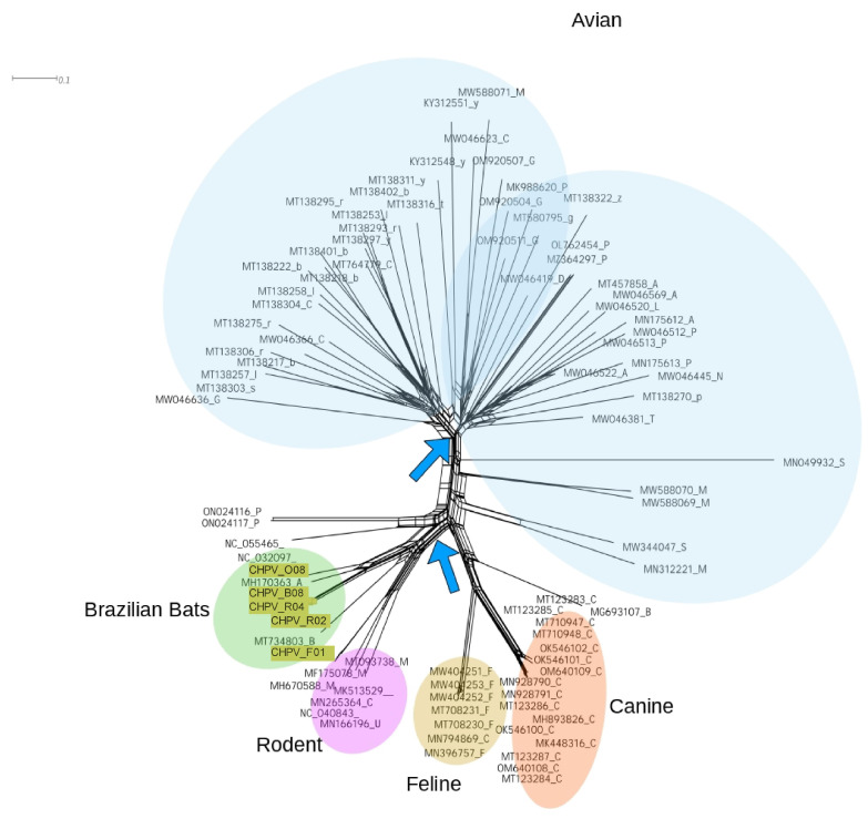
Figure 5.
Network graph of the NS1 genomic region of CHPV. The diagram shows a network clustering similar sequences. The main clusters are indicated by different colors. Sequences from this study are highlighted. Arrows indicate reticulated edges connecting sequences. Distances were calculated assuming the HKY85 evolutionary model. The network was constructed using the neighbornet approach implemented in Splitstree version 4.18.3 [55].

