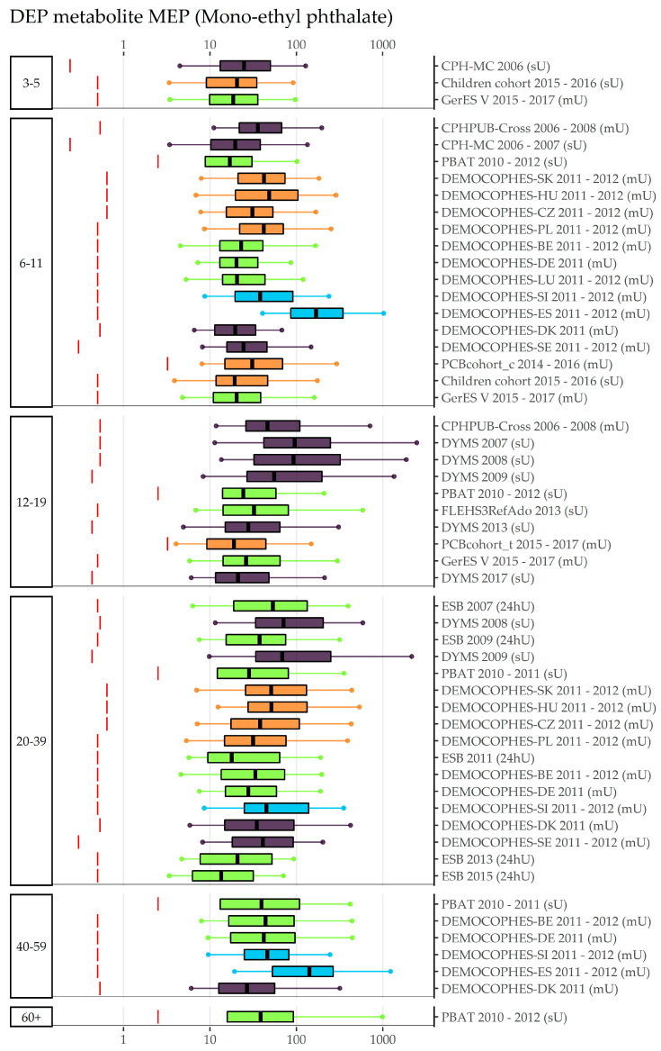
Figure 5.
DEP metabolite MEP concentration in µg/L in boxplots. The box is based on P25, P50, and P75, and the whiskers are based on P5 and P95. Boxplots are presented separately by age groups; within age groups they are chronologically sorted by year of sampling. Colors of the boxplots refer to the data collection’s region (North = violet, South = blue, West = green, East = orange, Israel = dark red). Red lines denote LOQ/LOD for the respective study. Since percentiles are only available and displayed when they are above LOQ/LOD, the lower side of the boxplots might be truncated.

