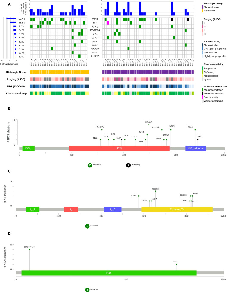
Figure 3.
Waterfall plot of the known and/or predicted driver mutation spectrum of Testicular Germ Cell Tumor (TGCT). (A) Plots show the frequency of samples mutated for seminomas and non-seminomas. The upper panel demonstrates the frequency of mutation for each sample. The left panel shows the frequency of samples harboring mutations according to the gene. The lower panel indicates clinicopathologic data. (B) Variant distribution in TP53 gene. (C) Variant distribution in KIT gene. (D) Variant distribution in KRAS gene. All graphs depict a lollipop plot showing identified variants relative to a schematic representation of the gene. Any position with a mutation is shown with a circle, and the length of the line depends on the number of mutations detected at that codon. The grey bar represents the entire protein with different amino acid positions (aa). The colored boxes are specific functional domains. On top of the lollipops, the most frequent variants are annotated as the amino acid change at that specific site.

