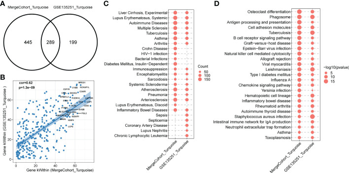
Figure 6.
Functional enrichment of MergeCohort_Turquoise and GSE135251_Turquoise module. (A) Venn diagram displays number of genes overlapped between MergeCohort_Turquoise and GSE135251_Turquoise module. (B) Spearman’s correlation between the kWithin of common genes (n = 289) overlapped between each module. Top 25 hub genes with the highest kWithin from MergeCohort_Turquoise module are shown. (C) Dot-plot heatmap shows top 20 significantly enriched disease by genes in each module. The size of each dot represent the gene counts enriched in each disease term. (D) Dot-plot heatmap shows top 20 significantly enriched KEGG pathways by genes in each module. The size of each dot represents the -log10 of p value for each KEGG pathway term.

