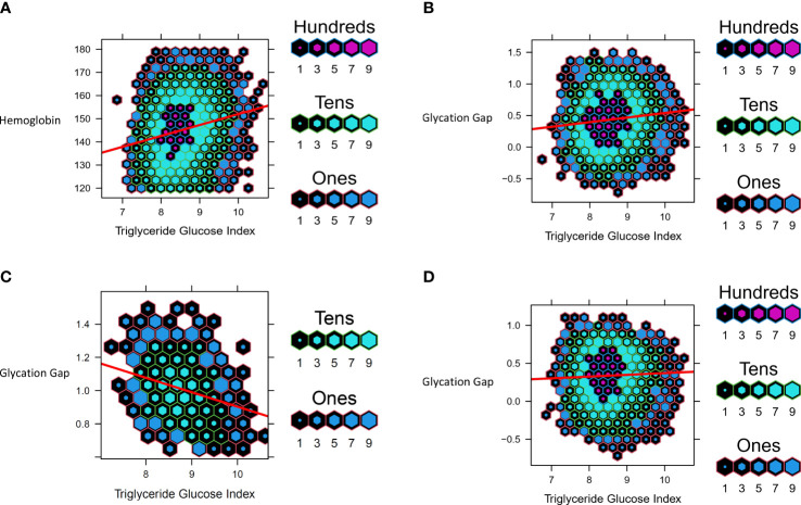
Figure 4.
Data from UHN cohort. Hexbin plots represent number of study participants with the observed and calculated values, where the color and size of each individual hexagon correlates to the number of participants with the corresponding values. The red line represents the regression line for each cohort. (A) Association between Triglyceride Glucose Index and Hemoglobin (B) Association between Triglyceride Glucose Index and Glycation Gap in all participants (C) Association between Triglyceride Glucose Index and Glycation Gap in with pre-T2D (D) Association between Triglyceride Glucose Index and Glycation Gap in those with normoglycemia.

