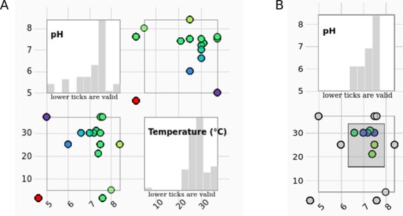
Figure 4.

(A) The scatter plot matrix of the entry data with histograms is showing measurement conditions (pH values in correlation with temperature) of the selected entries. (B) The data range can be selected by brushing on any of the scatter plots. Histograms change accordingly.
