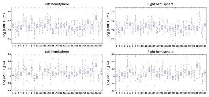
Fig. 4.
Box plots of log MRF T1 and T2 values of left and right hemispheres. Red line in the box indicates the median value. Asterisk indicates outliers. X-axis consists of 34 labels of the brain mask (labels shown in Table 1). The distribution of MRF T1 and T2 values across brain regions was significantly correlated between the left and right hemispheres using Spearman’s analysis (P < 0.001).

