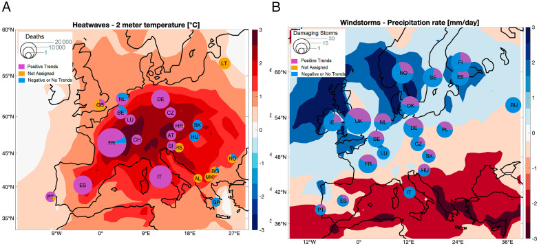
Fig. 3.
Impacts of changing atmospheric circulation patterns in terms of heatwave casualties and European Windstorms. (A) The size of the pie chart for each country shows the total number of heatwave excess deaths as recorded in the EM-DAT database for the whole year. The purple slices show the fraction of excess deaths associated with heatwaves showing an above-average frequency of circulation patterns with a positive occurrence trend. The yellow slices show the excess deaths associated with heatwaves that we excluded from our analysis (Methods). Finally, the blue slices show the corresponding fractions for heatwaves showing circulation patterns with no or negative occurrence trends. The shading on the geographical map shows the temperature anomalies (°C) during the 228 heatwave days retained for analysis. (B) The size of the pie chart for each country shows the total number of destructive windstorms in the storm database for the whole year (Methods). The purple slices show the fraction of windstorms showing an above-average frequency of circulation patterns with a positive occurrence trend. The blue slices show the corresponding fraction for windstorms showing analogs with no or negative occurrence trends. The shading on the geographical map shows the precipitation anomalies (mm day−1) during the 438 windstorm days retained for analysis.

