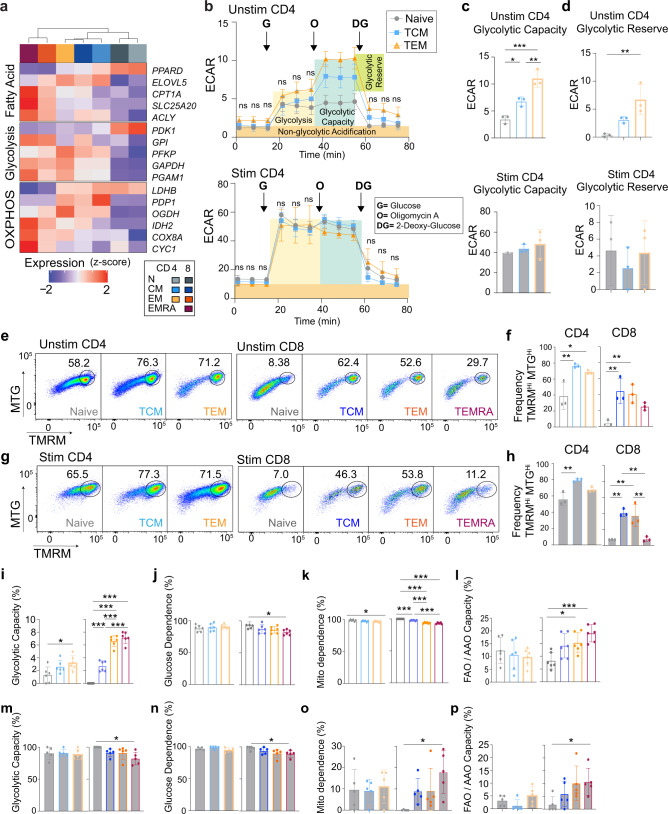
Fig. 3. MTC subsets exhibit distinct metabolic features.
a Heatmap of selected genes representing differences in metabolism. Data represent the mean expression of each cell subset. b Line plot showing Seahorse-derived ECAR data (mpH / min / 105 cells) over time for unstimulated and stimulated naïve, TCM, and TEM CD4+ T cells. Shaded regions indicate regions of metabolic relevance as labeled. Arrows indicate time of inhibitor addition (G, glucose; O, oligomycin; and DG: 2-deoxy-glucose). c, d Bar plots showing glycolytic capacity and glycolytic reserve calculated for unstimulated and stimulated CD4+ T cells, respectively. Error bars indicate ±SD. e Representative flow cytometry plots showing gating strategy for unstimulated cells using MitoTracker green (MTG) and tetramethylrhodamine methyl (TMRM). f Bar plots showing frequency of MTGHITMRMHI cells in naïve and MTC subsets. g Flow cytometry plots as in (e) for stimulated cells. h Bar plots showing frequencies as in (f). Bar plots showing metabolic attributes calculated from SCENITH data as indicated for unstimulated (i–l) and stimulated (m–p) cell types. Error bars indicate ±SD. For all experiments, 3–6 independent samples were analyzed. One-way ANOVA, with multiple comparisons were used to determine significance. *P < 0.05, **P < 0.01, ***P < 0.001.

