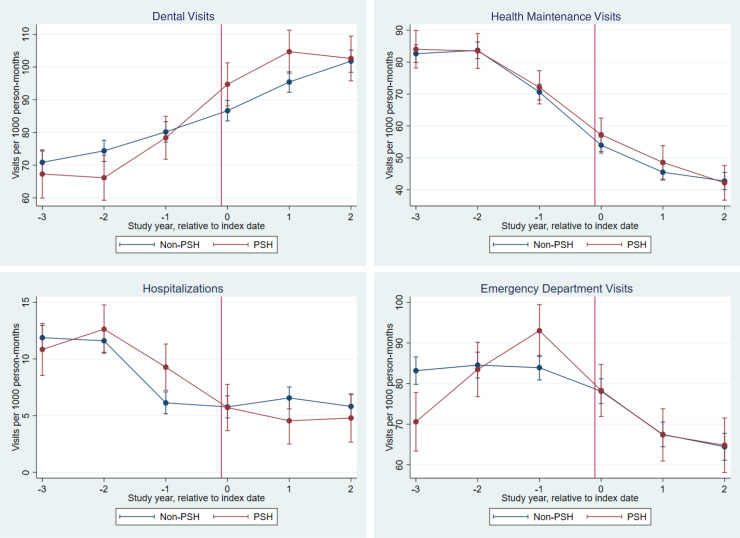
FIGURE 1.
Unadjusted utilization by year. Figures show unadjusted trends in our main utilization outcomes before and after entry into PSH (intervention cohort) and before and after the index date (comparison cohort), with entry or index date represented as a red, vertical line. Negative numbers on the horizontal indicate years before PSH entry or the index date, positive numbers indicate years following PSH entry or the index date, and 0 indicates the year beginning on the day of PSH entry or index date. Estimates plotted on the vertical axis represent unadjusted mean rates of utilization per 1000 person-months. The error bars represent 95% confidence intervals which account for clustering (each child in the intervention cohort and their set of matched comparators was defined as 1 cluster).

