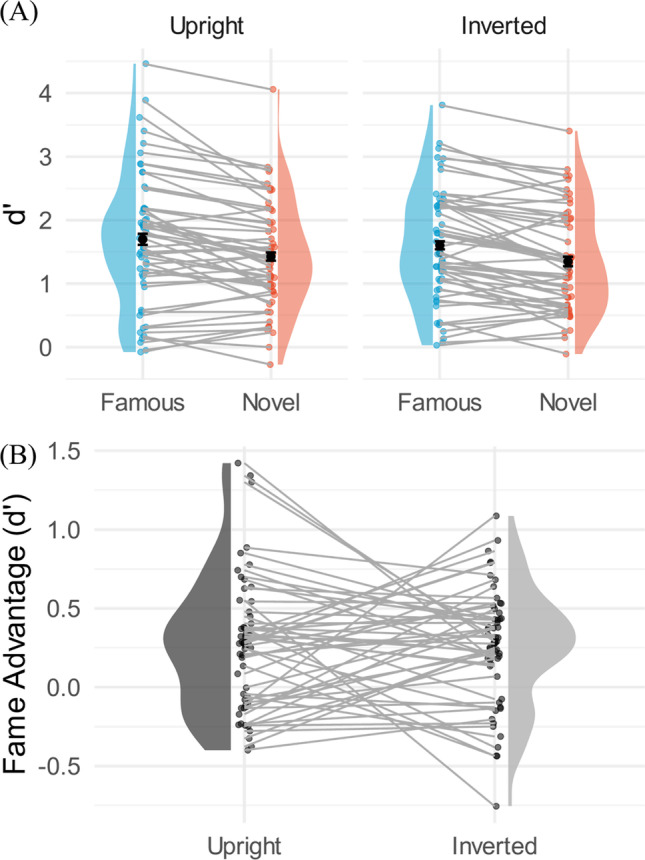
Fig. 4.

A Within-subject comparison violin plots for Experiment 2. Y-axis is the d’ measurements. The bar superimposed on the dots represents the 95% within-subject confidence interval based on the Cosineau-Morey-O’Brien method (Cousineau & O’Brien, 2014). The left-hand plots show the upright logos, and the right-hand plots show the inverted logos. Blue represents famous logos, and red represents the novel logos. The main effects of fame and orientation were significant, but no significant interaction was found. B The fame advantage in d’, shown on the y-axis, was computed by subtracting d’ of the novel condition from that of the famous condition. Each dot represents one participant, and each participant is connected with lines
