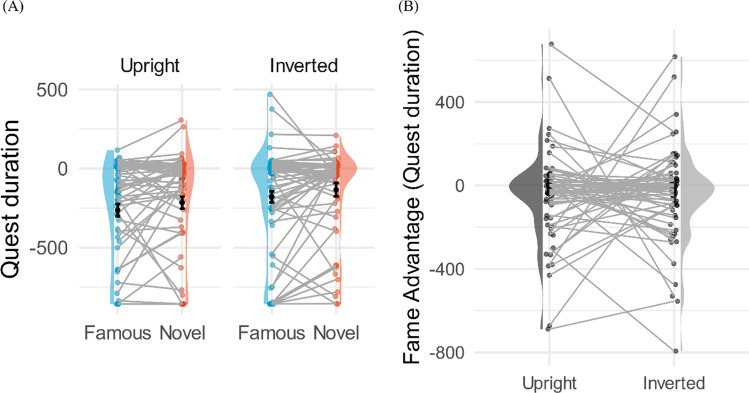
Fig. 9.
A Within-subject comparison violin plots for Experiment 4. Figure legends are the same as previous within-subject comparison violin plots. The y-axis shows the duration estimated by Quest algorithm. The bar within each raincloud represents the 95% within-subject confidence interval. The left-hand plots show the upright faces, and the right-hand plots show the inverted faces. Blue represents famous faces. Red represents novel faces. Main effects of fame and orientation were significant, and no interaction was observed. B The duration fame advantage is calculated by subtracting the duration estimated by Quest algorithm for the novel condition from the duration for the famous condition. Each dot represents one participant, and each participant is connected with a line

