. 2023 Feb 28;12:e83398. doi: 10.7554/eLife.83398

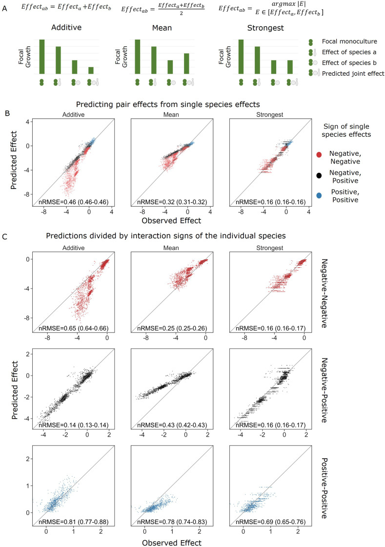
Figure 3. Strongest single-species effect offers the most accurate model for the combined effect of two species.

(A) Graphical representation for each model. The additive model assumes that the effects of each species will accumulate, indicating they are acting independently, and are unaffected by one another. The mean model assumes the combined effect will be an average of the two single-species effects. The final model, strongest effect, assumes that whichever species had a stronger effect on its own will determine the joint effect when paired with an additional species. The y-axis represents the growth of the focal species in different conditions, and in these examples effects are negative. (B) Comparison of predicted effects and the experimental data, with their respective root mean squared error normalized to the interquartile range of the observed data (nRMSE). nRMSE values are calculated from 1000 bootstrapped datasets and represent the median and interquartile range in parentheses (see ‘Materials and methods’). Each dot represents the joint effect of a pair of affecting species on a focal species. Colors indicate the signs of the measured effects of the individual affecting species. (C) Similar to panel (B), but data is stratified by interaction signs of the individual affecting species.

Figure 3.

Figure 3—figure supplement 1. Correlation between affecting species traits and effect on focal.
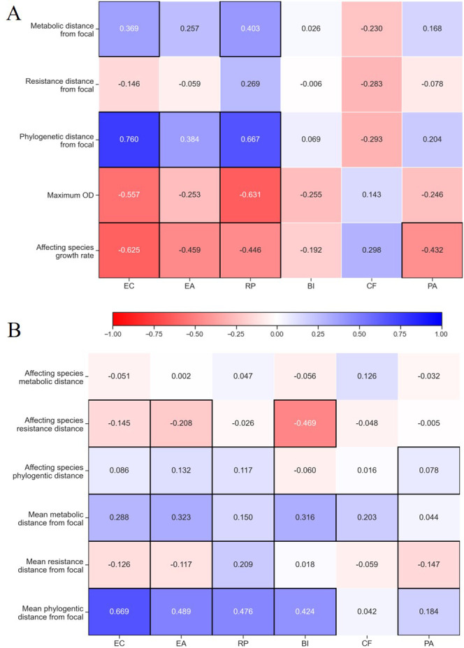
Figure 3—figure supplement 1.

Spearman correlation value for traits of (A) single species and (B) pairs and effect on species separated for each focal species individually. Correlations with p-values<0.05 are highlighted with a black frame. The growth rate and maximum OD shown in panel (A) were measured only in M9 glucose, similar to conditions used in the interaction assays. See ‘Materials and methods’ for calculations of phenotypic and phylogenetic distances.
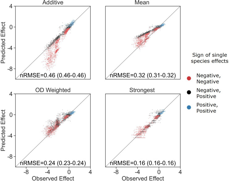
Figure 3—figure supplement 2. OD-weighted mean model.

Figure 3—figure supplement 2.

Correlation between four different models for how single-species effects combine into pair effects and the experimental data, with their respective normalized root mean squared error (nRMSE). nRMSE values are calculated from 1000 bootstrapped datasets and represent the median and interquartile range in parentheses (see ‘Materials and methods’). Similar to Figure 3B with the addition of the OD-weighted mean.
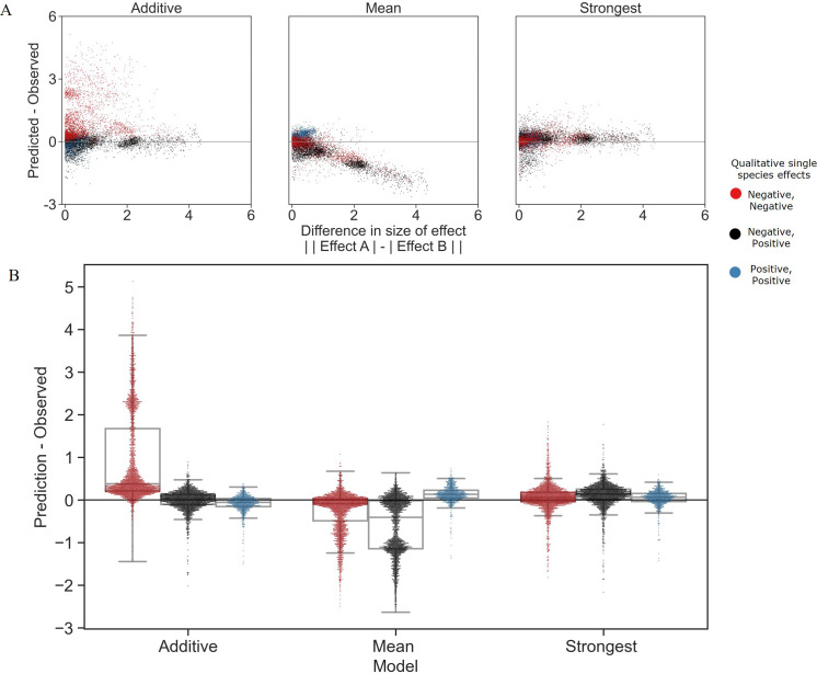
Figure 3—figure supplement 3. Distribution of errors for each model predicting pair effects from single species.

Figure 3—figure supplement 3.

(A) The accuracy of each model as a function of the difference between the sizes of effect of each individual species within the pair. (B) Distribution of the prediction accuracy for each model. Dots represent individual measurements, solid lines represent the median, boxes represent the interquartile range, and whiskers are expanded to include values no further than 1.5× interquartile range. The frequencies of these interaction types in the dataset are negative–negative 48%, positive–positive 14%, and negative–positive 38%.
Figure 3—figure supplement 4. Traits effect on model error.
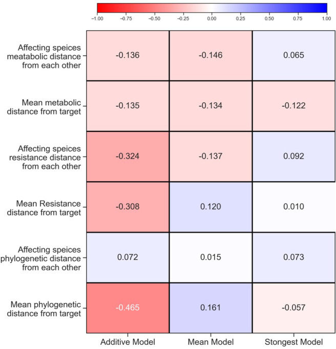
Figure 3—figure supplement 4.

Pearson correlation value for each trait and the deviation of the model. Correlations with p-values<0.05 are highlighted with a black frame. See ‘Materials and methods’ for calculations of phenotypic and phylogenetic distances.
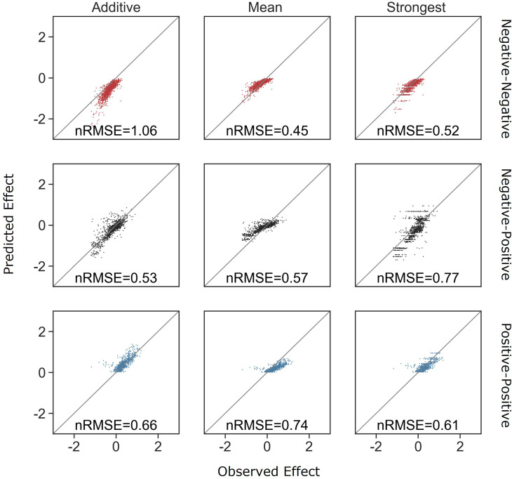
Figure 3—figure supplement 5. Accuracy of all models is reduced when considering only combinations of strains that have weak effects.

Figure 3—figure supplement 5.

Correlation between the different models for how single-species effects combine into pair effects, and the experimental data, with their respective normalized root mean squared error. Negative effects and mixed effects were limited to pairs with a combined effect no stronger than –1.2 (the maximum positive effect observed). As the negative–negative and negative–positive predictions become less accurate with these datasets, we posit part of the reason positive–positive interactions were difficult to predict is due to their small effect size.
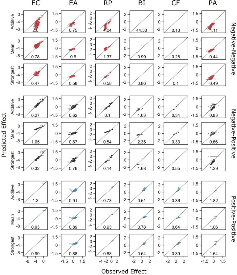
Figure 3—figure supplement 6. Model comparisons stratified by focal species and interaction type.

Figure 3—figure supplement 6.

Correlation between the different models for how single-species effects combine, and the experimental data, with their respective normalized root squared mean error. Data is divided for each focal species and interaction type individually.