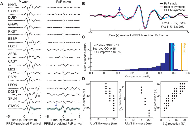
Fig. 3. Example ULVZ modeling.
(A) Example P and PcP waveforms from a TAMNNET-recorded event that occurred on 2 November 2015. All P traces have been normalized so that their maximum amplitudes are ±1.0; however, the PcP traces are normalized by their corresponding, original P amplitude. This emphasizes the difference in amplitude between the two phases. Bottom traces show the corresponding HIPR-weighted stacks, where shading indicates one SD. The stacks are also normalized so their maximum amplitudes are ±1.0. (B) HIPR-based PcP stack (black) along with synthetics from PREM (cyan) and from the best-fit model (pink). ULVZ parameters for the best-fit model are also listed (H: ULVZ thickness). In both (A) and (B), the small arrow indicates a ULVZ precursor on the PcP stack. (C) Histogram showing the range of CQ values across all synthetic models. The CQ values for PREM and the average CQ over the top 100 best-fit models are marked by cyan and orange lines, respectively. For reference, the PcP stack SNR, the average CQ value, and the average percent CQ improvement over PREM are provided (note: averages are again over the top 100 best-fit models). (D) Scatter plots showing the range of ULVZ parameters for the top 100 best-fit models. Models that only differ by δρ plot atop one another. Results were obtained using the method described by Hansen et al. (15).

