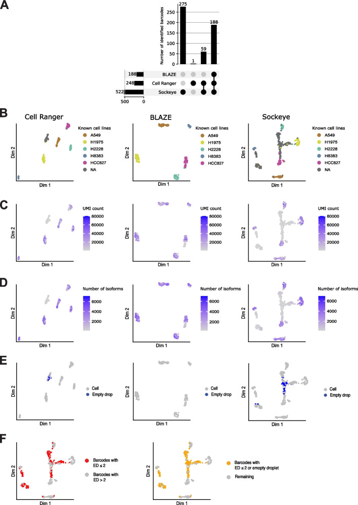
Fig. 5.
Barcode identification and clustering of Scmixology2 data. A Barcode upset plot comparing different whitelists. The bar chart on left shows the total number of barcodes found by each tool. Bar chart on top shows the number of barcodes in the intersection of whitelists from specific combinations of methods. The dots and lines underneath show the combinations. B–D Isoform expression UMAP plots: Isoform counts were generated with FLAMES using a barcode whitelist from either Cell Ranger (left), BLAZE (middle), or Sockeye (right). Cells are colored based on known cell types from Tian et al. [15] (B), total UMIs per cell (C), number of isoforms detected in each cell (D), and cells that are empty droplets (E). F Sockeye UMAP colored based on edit distance ≤ 2 or empty droplet

