Fig. 4.
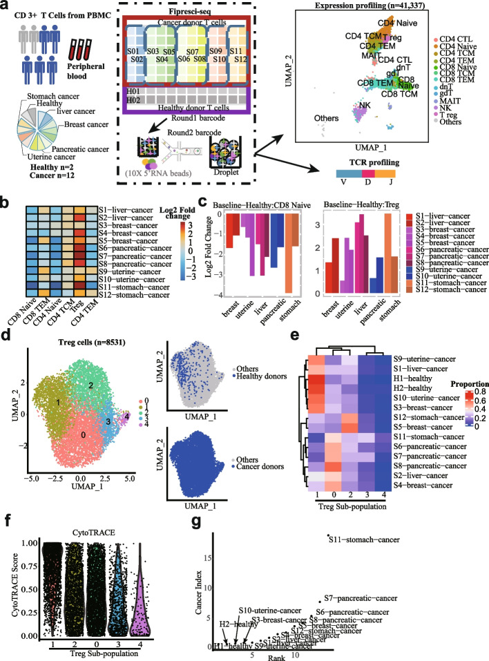
Single-cell transcriptome landscape of pan-cancer T cells FIPRESCI. a Flowchart depicting the overall experimental design of T cells (from peripheral blood of human donors (n = 14)) single-cell expression profiling and paired TCR profiling by FIPRESCI. UMAP plot (upper right) showing the major cell types detected. Total single cells (n = 41,377). b Heatmap showing the composition of the major T cell subtypes for different cancer patients and healthy donors. c Histogram showing the proportion change of the CD8 naïve (left) and T reg (right) in cancer patients compared to healthy donors. d Unsupervised clustering of Treg cells reveals 5 distinct Treg subpopulations. Left, UMAP embedding of 5 Treg subpopulation. Right top, UMAP plot colored by Treg cells from healthy donors. Right bottom, UMAP plot colored by Treg cells from cancer donors. e Heatmap showing five Treg subpopulations proportion over different donors. f Violin plot showing CytoTRACE Score distribution grouped by five Treg subpopulations. The order of subpopulations from left to right on the X-axis in descending order of mean CytoTRACE score within one subpopulation. g Dot plot showing the cancer index of each donor. Each dot represents one donor. Y-axis is the cancer index and X-axis is the rank according to the cancer index (the smaller the cancer index, the smaller the rank value)

