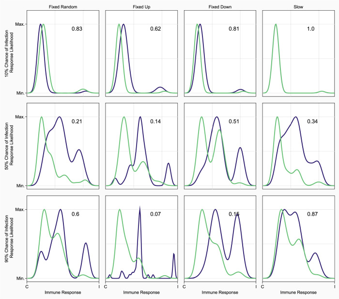
Fig 4. The immune response of the winning population of competitive scenarios was almost always more inducible than the immune response mounted by the losing population.
Immune response probability density function of pleiotropic winners (blue) and the last non-pleiotropic network (green) in the simulation. All plots on the same row have the same chance of infection (10%, 50%, or 90% descending), and plots in the same column have the same implementation of pleiotropy. The x-axis shows the percent of the response that is induced by parasites, with the left-hand side being 0% of response induced, to 100% induced responses on the right. The y-axis corresponds to the relative likelihood of finding an immune response in the specified population that is X% induced. 10 of 12 scenarios show pleiotropic winners being more inducible in their immune responses (as determined by right shifted density peaks) than their non-pleiotropic competitors. Each plot shows the results for competition after 250 generations of evolution.

