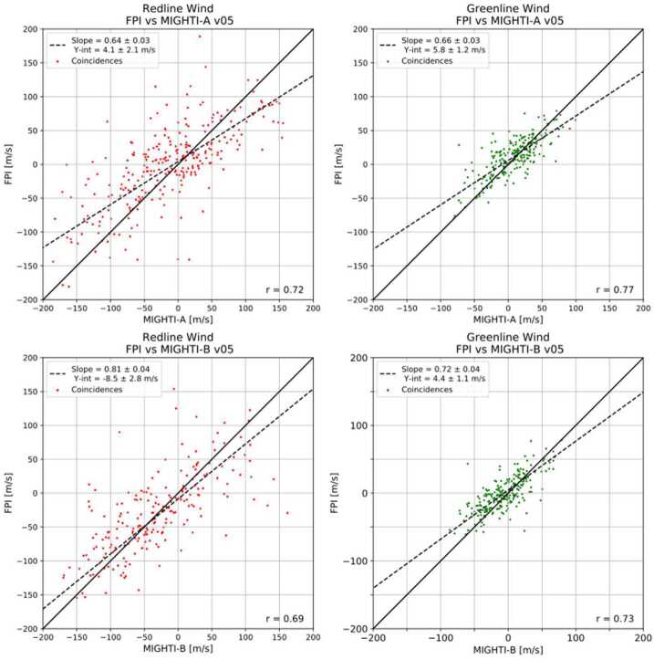
Fig. 31.
Comparison between thermospheric red-line wind measurements made by the FPIs at sites described in Table 4 and MIGHTI, along the MIGHTI-A line-of-sight (top left) and the MIGHTI-B line-of-sight (bottom left), and using the green-line emission for the MIGHTI-A line-of-sight (top right) and the MIGHTI-B line-of-sight (bottom right). The solid diagonal line represents a perfect match between the two data sets. The dashed line represents the best fit line to the data, with the parameters of that fit given in the legend of each subplot. The Pearson correlation coefficient is given in the bottom right of each subplot

