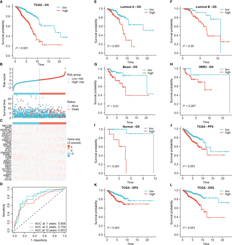
Figure 3.
Establishing the prognostic signature using the TCGA-BRCA cohort. (A) Kaplan-Meier overall survival curve of all patients. (B) Risk score and survival status of each patient. (C) Heat map of signature DRG expression. The color from blue to red represents the gene expression from low to high. (D) ROC curves for signature evaluation. (E–I) Kaplan-Meier overall survival curves of patients with different PAM50 types. PFS curve (J), DFS curve (K) and DSS curve (L) of all patients.

