Figure 9.
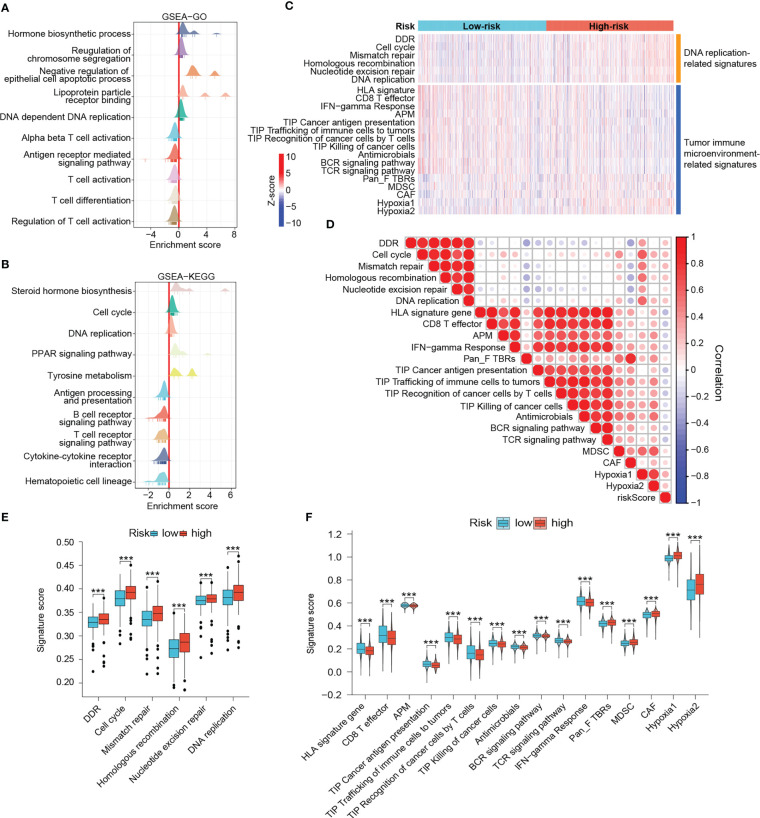
Outlining the DNA damage response and antitumor immunity landscapes. (A, B) GSEA results. In these ridge plots, an enrichment peak greater than 0 indicates that the pathway/term is enriched in the high-risk group while conversely, it is enriched in the low-risk group. (C) Heat map of DNA damage response and antitumor immunity signatures in risk groups. The color from blue to red represents the score from low to high. (D) Heat map of correlation between risk scores and different signatures. In this heat map, the size of the circle represents the statistical significance and the color represents the correlation. The color from blue to red represents the negative to positive correlation. Differential scores of DNA damage response (E) and antitumor immunity (F) between risk groups. (***P < 0.001).

