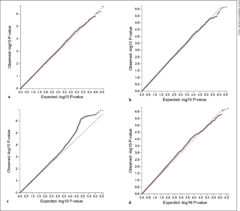
Fig. 6.
QQ plots for the p values from the genome-wide association discovery across the 3 predictive models (a is LASSO, b is ridge, and c is the Shen et al. procedure) and measured IQ (d) in the same individuals from the 13SK sample. p values are the dotted lines plotted based on their expected −log 10 p value on the x-axis and by their observed −log 10 p value on the right axis. The dashed line is the expected p value distribution under the null model. Deviation above the line represents signal more significant associations than expected.

